From Rhode Island Monthly | Photo: Jesse Burke Digital Rendering: Alan DiPetrillo
Sitting waiting to get my hairz cut flipping through the March issue of Rhode Island Monthly I came across this little piece in the magazine, Vital Signs.
When we asked Providence design guru Tyler Smith (creator of the award-winning Rhode Island license plate) to critique the local signage, we learned that simple is powerful, size is everything and our state has some confidence issues.
Smith critiques and makes suggestion for the sign on the new India Point Park Bridge, the RISD Chase Center, and the highway signs at the entrance to the state. Head over to Rhode Island monthly to read about it.
I love signs and dabble in design, so this little one-pager certainly caught my eye. I’ve often thought for a city that is home to one of the world’s most renowned design schools and has almost as many working designers per square mile and it does Dunkin Donuts, a lot of our signage is really piss poor. What are some of the signs in the area that make you cringe and how would you make them over?


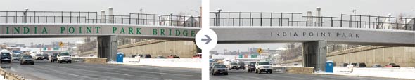
I drive under this bridge every day, so I think about it often… too often. “INDIA POINT PART BRIDGE” is so hilariously literal | Why does it need to say “Bridge?” Isn’t it obvious that it is a bridge??
Why stop there? Shouldn’t it really say:
“INDIA POINT PARK BRIDGE SIGN”?
My theory is that the engineer who designed the bridge put the words “INDIA POINT PARK BRIDGE” on the bridge when he or she made the first computer rendering of it, just so the rendering would look more interesting, but not really thinking about what the sign said. After that it was never questioned and was just carried through to implementation.
I suppose it should just say “INDIA POINT PARK”… But still, why is India Point Park so important? Shouldn’t it just say “Providence” or “Rhode Island” or some cheesy hopeful message like “We are all one”? (unless House of Blues has copyrighted that)…
We should have a “Comment of the Week” feature because yours made me laugh.
“India Point Park Bridge Sign”
I feel the urge to Photoshop.
India Point Park Bridge Sign Lettering
We should totally have a comment of the week, and that should be the inaugural one…
“My theory is that the engineer who designed the bridge put the words “INDIA POINT PARK BRIDGE” on the bridge when he or she made the first computer rendering of it…”
That is so outrageous that it’s likely true…
“But still, why is India Point Park so important? Shouldn’t it just say “Providence” or “Rhode Island”…”
That’s what I’ve thought all along… When I think of all of the potential spaces that go unused where the city could advertise events, attractions, or any aspect of itself on a flat screen with huge traffic exposure (that bridge, the empty VMA wall with the sad little VMA sign, etc) I get sad 🙁
I heard the reason they changed the sign was because of hard to remove graffiti. Any truth?
From what I understand, the decorative elements, such as the waves on the Iway portion are made of a graffiti resistant material. The surface behind the letters on the IPPB look to be the same material.
what if instead of the india point park bridge sign sign (yes, I meant to write “sign” twice) it was an electronic marquis with our comment of the week perpetually scrolling across it?
Ted’s comment would indeed make a fantastic inaugural fodder for the marquis.
I’m kind of joking.
but kind of not.