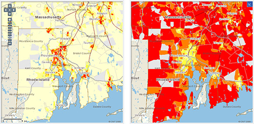
The Housing + Transportation Affordability Index has a number of tools for generating affordability maps. Above is the Providence Metropolitan Area CO2 use per acre (on right) versus CO2 use by household (left). I can’t hyperlink directly to the Providence map, but go here and choose “Providence-Fall River-Warwick, RI-MA” from the drop down where is says “change region.”
As you can see, by acre the cities consume way more CO2 as there are way more people per acre in the cities. However, when viewed by household, the cities are teetotallers compared to the suburbs. This comparison shows the benefit of mixed-use dense regions. Even if everyone in the cities were driving to all their destinations (which we are not), having a mixture of uses, means we do not have to travel as far to reach our destinations; shopping, working, recreation…
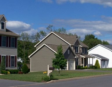
Now not everyone is going to move to Providence, New Bedford, and Fall River and start walking and riding the bus everywhere. But we can make the suburbs more walkable and less dependant on fossil fuels. Our region was built around distinct village centers, we’ve lost the village centers to autocentric strip malls such as those seen on Route 2. These areas are designed in such a way that even if one wanted to walk from store to store, one cannot.
As big box stores go out of business and leave empty hulks behind, it is a good time to rethink our suburban development patterns. How can we fill in areas that are sprawling and make them more like the village centers of yesteryear?


This is -way cool-. I wish there were more places to compile data like this.