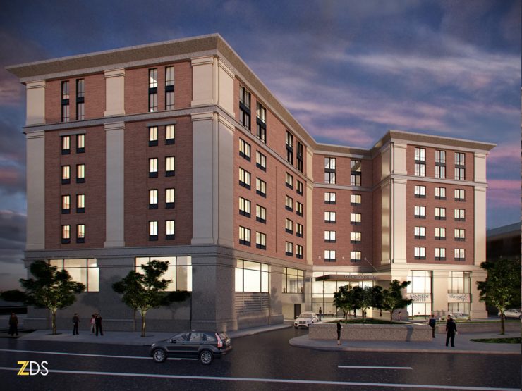
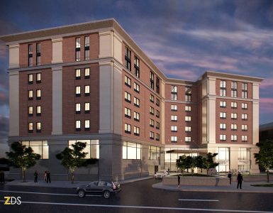
Updated renderings and plans for the Homewood Suites extended stay hotel proposed for Parcel 12. Presented to the Capital Center Commission Design Review Committee this morning. I’m told they were better received than the original proposal.

See also:
Providence Homewood Suites proposed for Capital Center Parcel 12 (June 11, 2015)[/alert]

Ground-floor retail and an updated, handsome facade? Build this.
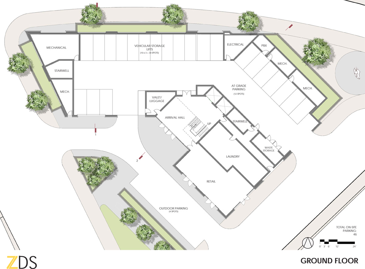
Definitely a better proposal! The ground-floor parking is really sad. 22 parking spots is nowhere near enough for a hotel this size even considering its location, so they will have to do off-site parking, probably right across Exchange street. Just knock it back to 15 or so spots on the ground floor and make the retail space actually nice. Exchange Street is a very important foot-traffic route and needs to be activated. Two retail spaces would be better, but if only one can be done, it needs to be on the Exchange Street side. The ground floor as proposed will end up as miserable as the ground floor of the Courtyard Marriott at Memorial and Francis.
Somewhat better.
Still not ideal, but better.
I still can’t see any reason why the retail and laundry areas on the ground floor can’t be bumped out towards KP with all access roads and parking spaces hidden internally. And parking lot access should be off Memorial.
Looks pretty good. I’m pretty happy that most of the parking is not outside but I would prefer the 4 outside parking spaces reduced to zero but everything can’t be perfect.
@Brendan- it looks like it’s actually 40 spots, 10 of them are storage lifts with three spots each. Still probably not enough, but a bit better.
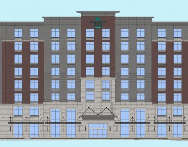
The plans are ok, I guess…. but the exterior?!?!… the pilasters are WAY too fat!… The cornice is un-articulated!… this is a McMotel in the heart of a classy old city… Are you kidding?
Hell, what you propose is SO wanting I’ll rework it FOR FREE (Seriously): TVABoston@hotmail.com. (No really -1. I’m not arrogant, 2. You folks are smarter than this, and 3. Providence wants your development dollars -simple facts).
If you disagree I suggest you swallow your pride (Pssst -this is reeeally crappy). If you’re not going to hire a real classicist designer/architect (I know plenty) don’t pretend to; make it a modern building -avoid the faux veneer.
I tell ya, this building, as the design now stands, is better suited to a suburb of Lansing, or Baton Rouge. Providence has, and should continue to do better.
Looks good…just wish the footprint was smaller and the height 10-12.
What’s up with the proportions of the windows to the walls on the upper floors? The windows look like arrow slits compared to the other elements on the exterior.
This design is fine. Interesting how poor results can be transformed by hiring a new architect. This architect knows how to design a hotel. The other didn’t.
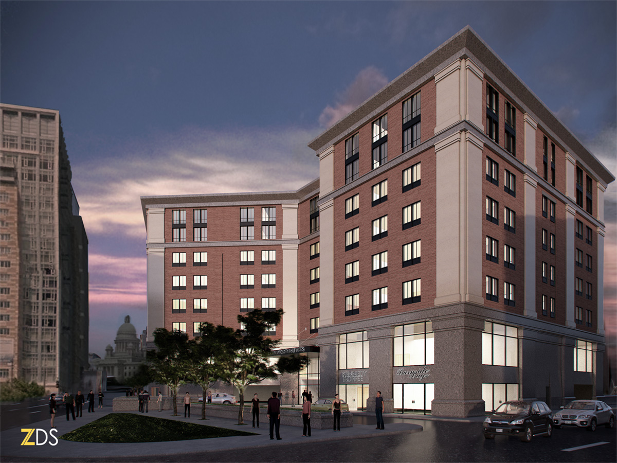
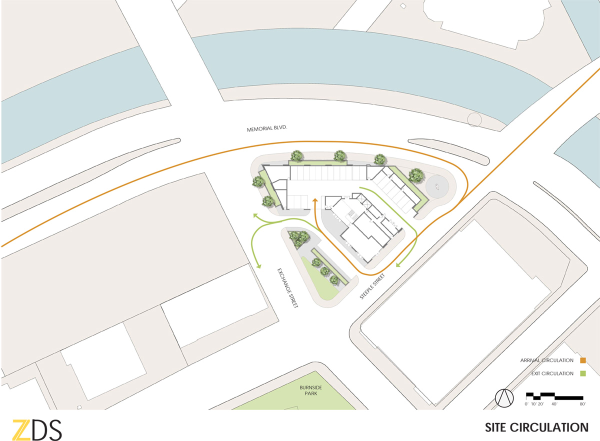
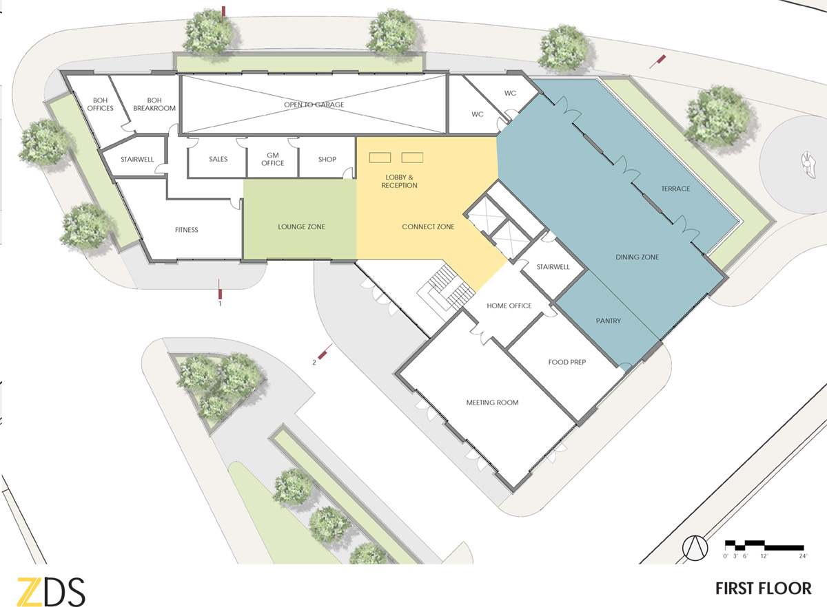
The layout of the hotel is superior to what they had previously. Steeple Street is no longer Garbage Way. The circular suburban drop-off/surface parking lot is gone. The hotel entrance no longer faces the highway-like boulevard and the landscape of the new entrance plaza complements Burnside Park. The massing holds the streetwall partly on Steeple and Exchange Streets and fully on Memorial Blvd including acknowledging the steeply setback streetwall of the back of the post office and federal buildings that face College Hill. The retail is located near the more pedestrian street frontages of Steeple and Exchange Streets.
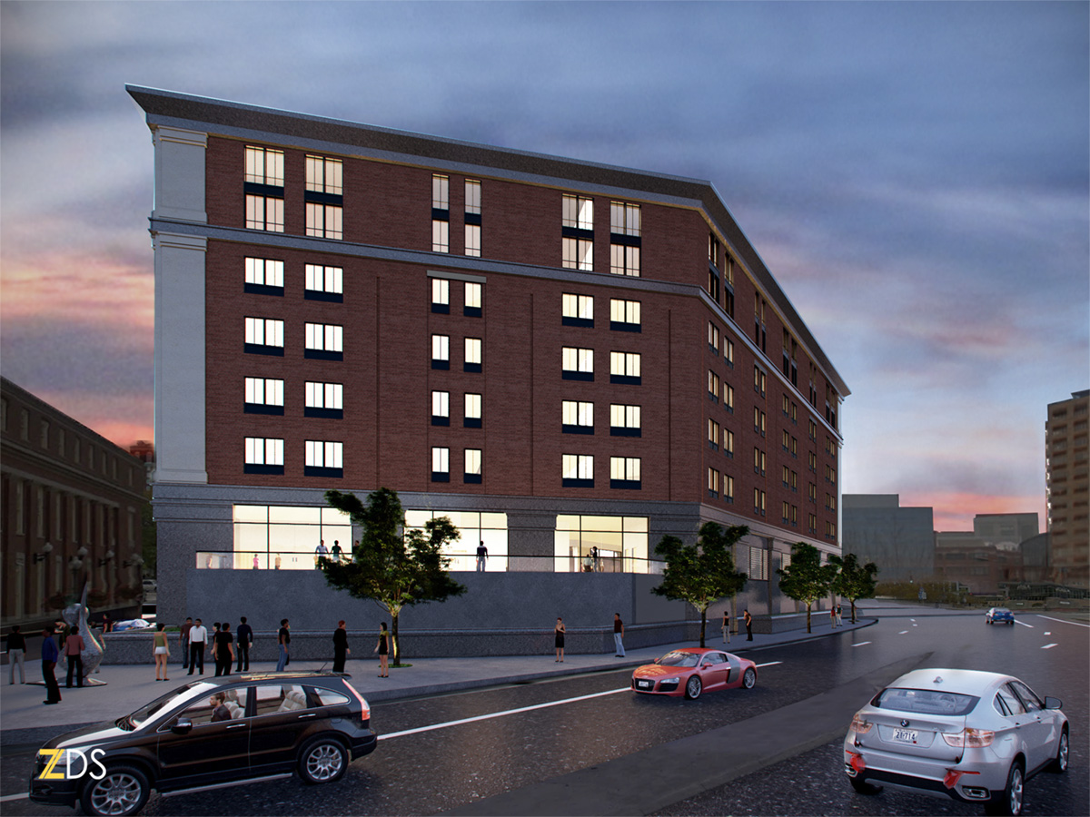
Other than the four parallel parking spaces in the drop off lane, parking is now fully within the building. The drop off is more subtle and urban, not unlike the Biltmore entrance, though there is a generous landscaped buffer fronting Exchange Street. Generally the landscaping around the property seems well done offering a variety of spaces that guests or the public could use. I question the high wall that conceals the parking on Memorial Blvd. Perhaps vines could be planted to crawl up the wall to soften it. Also a water feature on the wall facing the triangular plaza at Memorial and Steeple might help.
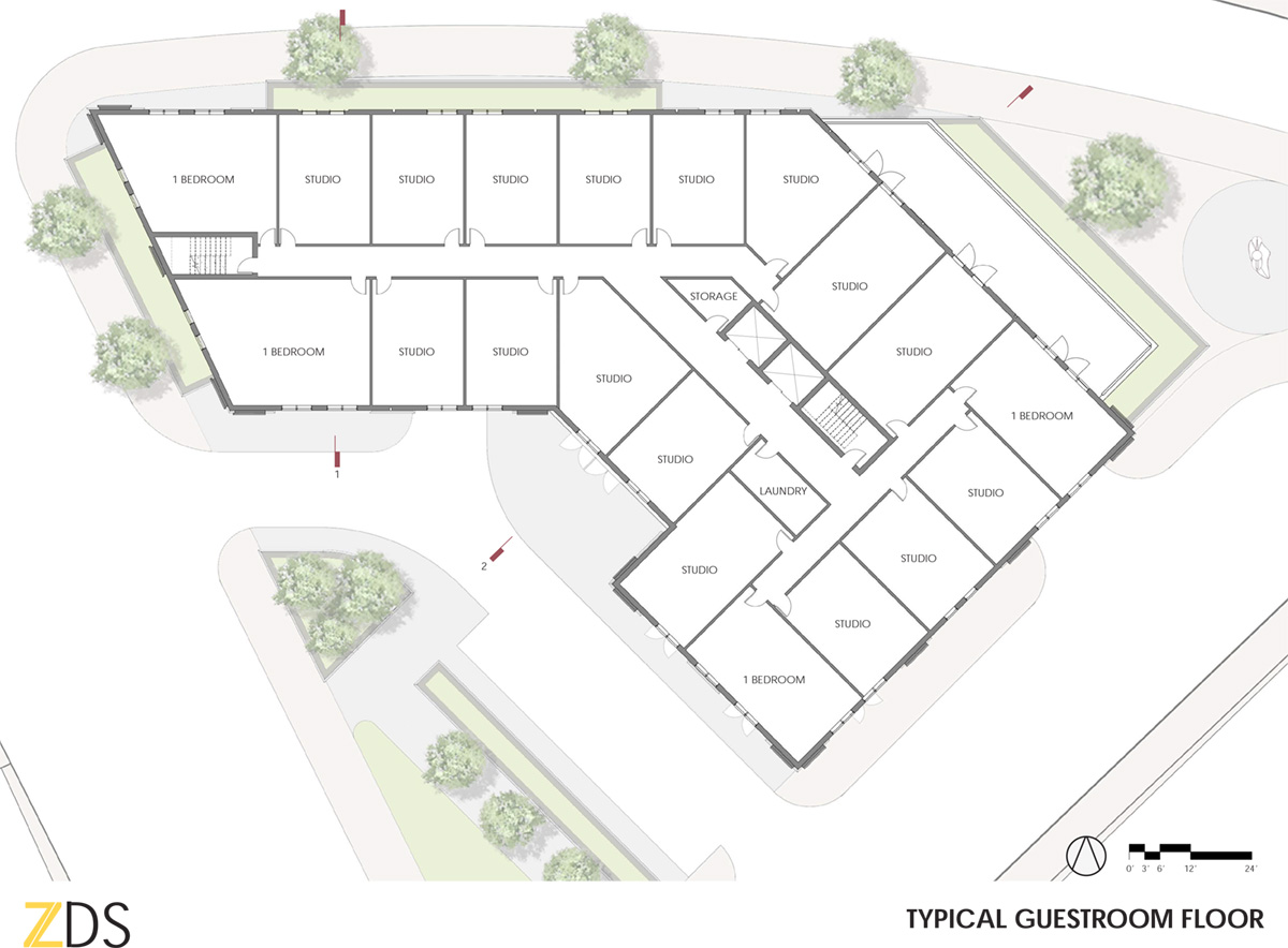
The ground floor and lobby level (first floor) should work well. The room layouts look plausible, where they didn’t in the early version. The first floor dining “zone” with its terrace takes advantage of views of the river and College Hill, which will be great for the hotel guests.
I would have preferred a more modern expression for the facade, but what has been developed is perfectly presentable, unlike the previous proposal. The facade direction could simply be the result of the developer’s taste. However, with many proposals in Providence often neo-classical elements tend to be used, which might be developer’s attempts to fit in with the historic heritage of the city or to not make waves with the public.
They did a good job turning this project around.
Peter Brassard, back to design school for you! ; )….. “Perfectly Presentable” is a euphemism for INFERIOR… please, call a spade a spade! The exterior is wanting BIG time. Its so badly proportioned -again, more suited to an airport road in Alaxandria VA than stately Providence.
The big question is whether the developers and their agents will admit this design (exterior, at least) needs a lot more TLC.
Jeff Nickerson, would you PLEASE opine on this Homewood effort? Its not like we’re getting Marilyn Munster here… we need a forceful rebuke -they are attempting neo-classical design without the training and a reality-based exterior budget. The result is an ersatz train wreck. Look at those FAT ugly pilasters!!!… Doesn’t anyone take the built environment seriously anymore?…. Don’t the proponents stand to learn anything?… or do they “know it all” because the intend to spend money Downtown? Can someone please guide them along Benefit Street with a camera?…. I will take them myself -surely they have a sense of humor and can take criticism, no?……..
The remaining problems here are not pilasters. They are problems of urban form.
If they need a hint about improving that, these developers need only look across the Plaza to the Biltmore.
So True, Biltmore Sam… I was trying to be kind.
You know, and I know, that this project belongs in…. uhh… hmmm…
Scranton!…. yeah, that’s it!….
Sigh.
It’s a newer variation and similar in its artificiality to the Courtyard down the road. Postmodernism had its heyday in the 90s. Many in Providence have yet to realize that. In the rendering it’s especially disconcerting to see the Waterplace buildings in the background. That relationship makes the design look more forced and fake. However, even if it’s built as is, it will likely be a good hotel judging from the plans and its still huge improvement from the first proposal. Maybe a better word to describe it would have been passable.
I think this is a significant upgrade from the earlier proposal, but still a little lacking. I know it’s probably a fone deal at this point, but if I could sneak in one ammendment to this, it would be this:
OK, here is my slightly drunk, late Thursday night take on this building.
First, on the upper floors, why are the windows so small? We never saw an in place rendering of the original proposal, but it seemed to have more glass. I’ve never extended stayed at a hotel in another city, but I imagine if I did I’d want some light and to see where I am. Make the whole wall of the room be glass and then let me draw the blinds as far as I need to depending on what or who I’m doing in my room at a given time. Look at those plans for the guestroom floors, do you want to stay in that dank dark room with those sad little windows?
The windows on the top two floors at least are arranged in a way that lends some verticality to the building. The Memorial walls are wide and nothing will probably make them look tall, but the facades that face Burnside Park would look tall and more impressive if the windows read vertical.
The street facade along Exchange needs to have glass to the sidewalk. Zoning demands that (I think zoning also demands that on Memorial (I’m pretty sure Memorial would be classified an ‘A’ street) but I’m willing to let Memorial go as I said regarding the previous design). Even if the glass on the Exchange side is showing internal circulation, pedestrians on their way from Kennedy Plaza to the train station need something to look at. This is why our zoning calls for glazing on the ground floors on ‘A’ streets.
The pilasters are completely ridiculous. Why oh why are they so wide? It makes the building look further squat.
The “Typical Guestroom Floor” plan still shows the doors from the “First Floor” plan which open on to the terrace of that plan. This appears to be a mistake of not turning off the layer from the previous floor. However, the rooms on that side should have doors on to balconies. That would add cost but those would be premium rooms overlooking the RISD riverfront (and WaterFire) and would further activate the building facing Memorial.
The driveway area and the small ‘parklet’ that faces Burnside Park needs a lot of attention to work well and be activated and not just be some sad shrubs collecting stray Dunkin Donuts cups. Make it all hardscape and tables with well tended planters and wifi and create a space where guests and patrons of the retail space (I’m assuming it will be a cafe and that is actually a fine use, a Starbucks at the Biltmore and one here actually might work fine) will want to sit and linger. And, the entire planting/landscape plans on all sides need to be top notch, especially on Memorial where I’m happy to give up any hope of retail and glass frontage, just make sure it presents impecably.
But, my real problem with this building is the brick. The brick and it wanting to fit in. I said in my critique of the original plan, I’d love to see glass here. Really, what are we recreating with this brick? In all of our living memories, this parcel was either vacant or in the river. I think at times in history there was maybe something connected to the train station or the post office sitting here (I’m too tired to research that now) but really, this parcel is riverbottom. Let’s acknowledge that by not trying to create something that looks like it was always here (we don’t have the money or seeemingly the architectural talent to pull that off anyway), let’s recognize that this is new land and build a new building here.
The weird angles of this building and this lot give well to a glass treatment, a piece of crystal that was dropped on this new peice of land reveled from the bottom of the Woonasquatucket. STOP CLADDING EVERYTHING IN BRICK!
There are places where trying to fix holes that were made are fine, there are places where blending in with what is there is fine. For example, if (WHEN) we ever get something built on the last Union Station parcel, I’m all about making that building out of brick and blending it with the rest of the Union Station buildings (new and old). I’m all about a balance of blendable brick and new invovative design on the 195 land.
This weird parcel on the edge of Kennedy Plaza, in line with our transportation hubs, along one of the most important automobile gateways to the city, across the river from the world’s top design school, on a piece of land that used to be river bottom, can we drop they brick for just a minute?
David, I like your retail nose, except I’d rather see it along the Exchange side than the Steeple. If there was a way to allow for a Biltmore style driveway along Steeple with access to the garage they want, and the retail nose along Exchange, it would be pretty good.
I keep thinking of the Millennium Bostonian on North Street outside Faneuil Hall. It has a discreet driveway off the street with a circle inside. The pedestrian barely knows it is there. I only know it is there because I peed in that hotel once.
Jeff, Yes, Millennium comparison is spot on… Note awnings and French Balconies… This design is fully contemporary, yet melds into its Blackstone Block surroundings beautifully.
David, exactly the sort of thing I mean. Actually, I would probably push the retail projection even further, right out to the street, and make the dropoff/turnaround internal — as in Jef’s Millennium Bostonian example.
Jef, there’s the old piss’ n’ vinegar!
“we don’t have the money or seemingly the architectural talent to pull that off anyway”
Love it. Disagree about brick. I’m fine with brick. It’s the parklet, surface parking spaces, and dropoff area that I hate here. And I hate the fact that it seems to require so little imagination to rework those aspects of this proposal, yet that extra bit of imagination was obviously too much exertion for the architect and developer, who chose to cut literal and figurative corners instead.
Passable. Peter found a good word, there. Solid D+ effort. Passable. Better than the previous proposal … virtually by default, as the previous proposal was pure sh**.
Meh.
I can’t imagine why something so important as design, something that is a first impression of their brand as a hotel, isn’t one of their top priorities. Get creative. Hire a pvd design student or something.
I think its a huge improvement. I like the orientation much better with the driveway/plaza facing Kennedy Plaza. I like the brick as well. The retail is awesome too, I’d think it fit in nicely. The columns are quite large but I don’t see that becoming a huge edit to the design, nor do I see it as a huge design flaw.