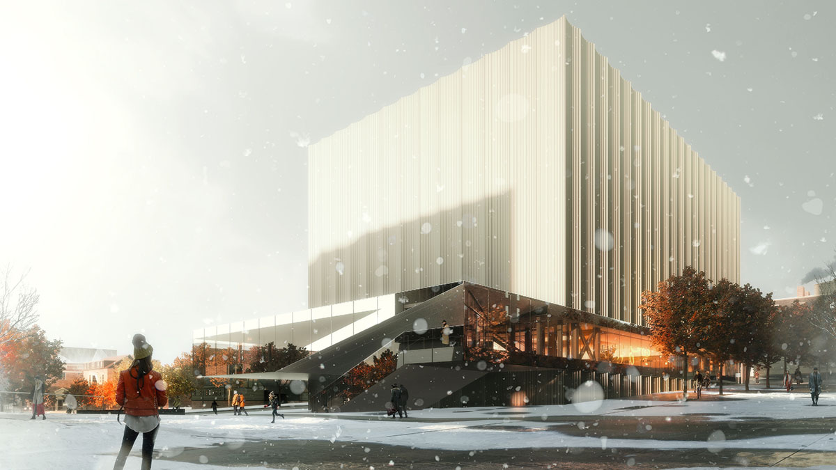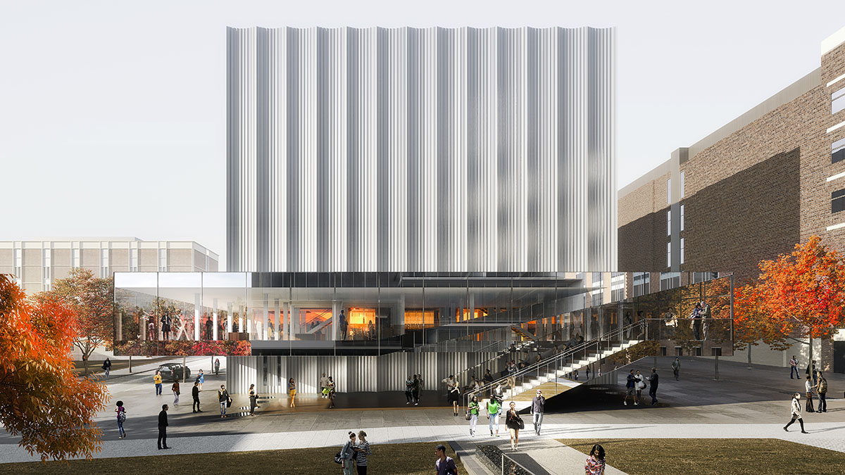

Renderings from Brown University by REX
Press release from Brown University:
With a radical, one-of-a-kind approach to spatial, acoustic and technical flexibility, Brown University’s planned Performing Arts Center (PAC) is designed to inspire innovative new art-making, enable unprecedented artistic collaboration and serve as a hub for performance at Brown.
That singular flexibility, along with a horizontal “clearstory” that slices through the building’s façade at stage level, are among the signature elements of the PAC, as debuted in a set of architectural renderings and animations released by Brown and New York-based architecture firm REX on Wednesday, Feb. 13.
The renderings reveal plans for a state-of-the-art main performance hall that can transform into any of five vastly different stage/audience configurations — ranging from a 625-seat symphony orchestra hall, to a 250-seat proscenium theater, to an immersive surround-sound cube for experimental media performance.
View a video rendering of the building on the Performing Arts Center website.


Why it interacts with the street with all of the grace and beauty of the Fogarty Building. Uhhh, Hrmm….
You can put snowflakes on the rendering but it still looks like a shipping warehouse…very sorry for the east side. This is a low quality effort from REX architects. Brown should have some backbone to push back on this. My understanding is that most of the program has been buried below ground in ledge that needs to be excavated. Sigh….
Totally agree with Allen. Looks like a 1960’s furniture showroom. Wrapping it in a different skin could help. Also troubling, though, is that PAC-MAN intrudes on and destroys the hard-won green space of the Walk. The Walk had the potential to organize over time a varied, energetic yet harmonious space like the Main Green or the Back Green. And Ganoff Center supposedly was pulled back from the Walk’s eastern margin to help create a destination plaza at the Walk’s northern terminus. Now that concept has been obliterated. The PAC-MAN gobbles up the green and more than ignoring Ganoff insults it. Sigh.
It is really retro looking isn’t it? Like a late 60’s suburban department store. Probably cheaper to build this than an actually “state of the art” design, but it’s a shame it looks cheap too.
I actually don’t mind the overall retro look of it, but I see all of the dead space under the glass overhang as being really terrible. Run the glass down to ground level and you could have a larger lobby and additional gallery space while greatly improving the way it interacts with pedestrians.